Caslon and Baskerville
Typeface Comparison Poster
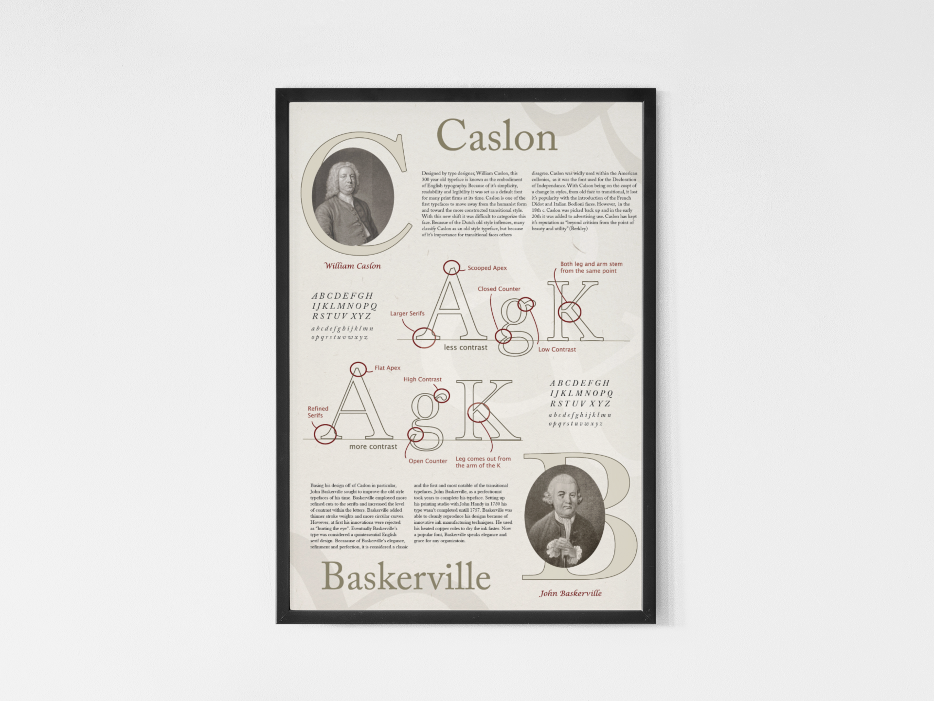
This poster compares two of the most historically influential typefaces that are still widely used today, Caslon and Baskerville. Both of these typefaces were some of the first to move away from the humanist style of type and toward a more constructed transitional style. Baskerville, being known as the first and most notable of the transitional typefaces was heavily influenced by the innovation of Caslon who came before him. Because of Caslon’s effect on the shift to a transitional style scholars debate how to classify it. Whether it be an Old style of a Transitional, Caslon had a huge effect on changing the industry of type through its simplicity, readability and legibility. Baskerville, however, with its refined cuts and increased contrast, achieved an elegance, refinement and a sort of perfection that could create a new style.
Category
Poster Design

